16 Oct 2026 · aaoms Team · 2 min read
A colour chart for Nepal's clinical floors
Navy in one ward and navy in another are not always the same navy. A shared reference fixes that.

Colour consistency sounds like a small thing until a hospital has two wards in two shades of navy.
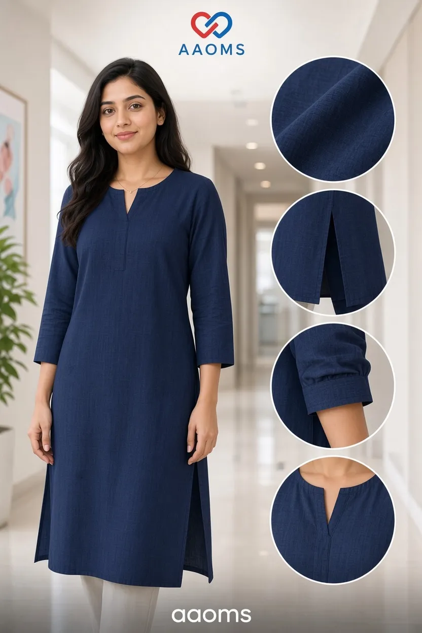
It happens for a boring reason. Fabric is dyed in lots, and dye lots move slightly. A hospital that orders in January and again in August, from the same supplier and the same colour name, can still receive a garment that reads differently under ward lighting.
The fix is not a promise. It is a reference.
We keep a physical colour chart, and for institutional orders we send the relevant swatches to the hospital before production. The matron or the stores officer holds the swatch against the actual lighting in the actual ward. That is the only test that matters, because a colour that reads correctly in an office window can read badly under fluorescent tubes.
When Yamuna Karki, a matron in Birgunj, held our navy swatch against her ward lighting, the difference from her existing sets was visible in seconds. She chose the closer lot, and the two wards have matched since.
Two things follow from having a chart.
First, reorders become predictable. When a department needs twenty more sets six months later, the reference is the swatch, not a photograph, and the match is judged against something real.
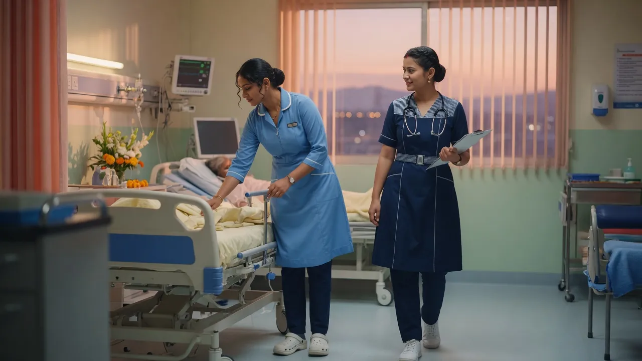
Second, departments can be told apart without shouting. A hospital that runs navy for general wards, ceil blue for paediatrics and green for theatre is using colour as wayfinding. That only works if the colours stay put.
A practical note on photography. Never approve a colour from a phone photo. Screens shift, lighting shifts, and the compression does its own damage. If you cannot hold a swatch, ask for one to be couriered before you sign off.
The chart costs us money to maintain. It saves a great deal more in replacements.
Need this measured properly?
Send your numbers, or book a call and we will take them with you.